
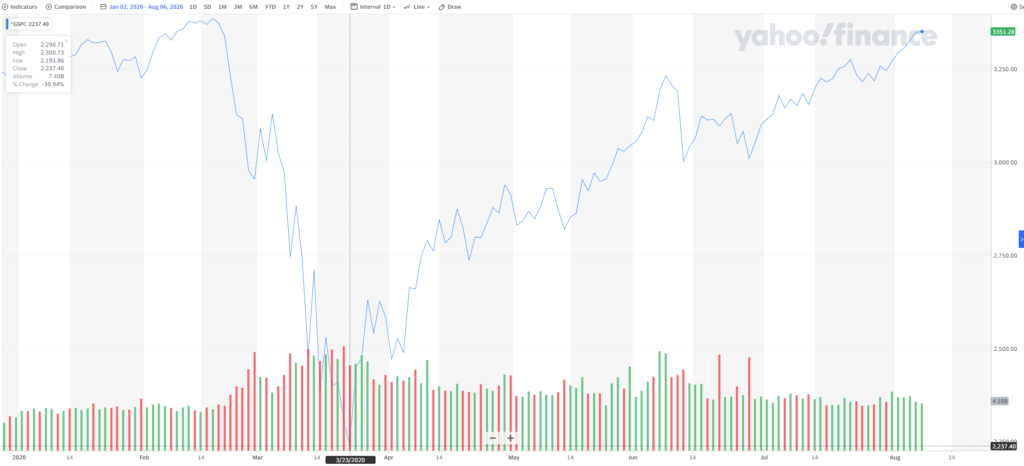
2020 has seen the greatest market volatility in history for American stocks. The roller-coaster ride investors have experienced over the last 6 months included a steep ~33% single-month drop followed by a four-month bull market run taking the S&P500 back roughly to where it started.
While not usually so dramatic, volatility is a fact of life for investors. In researching how to create a long-term investment strategy that can cope with volatility, I found a lot of the writing on the subject unsatisfying for two reasons:
First, much of the writing on investment approaches leans heavily on historical comparisons (or “backtesting”). While it’s important to understand how a particular approach would play out in the past, it is dangerous to assume that volatility will always play out in the same way. For example, take a series of coin tosses. It’s possible that during the most recent 100 flips, the coin came up heads 10 times in a row. Relying mainly on backtesting this particular sequence of coin tosses could lead to conclusions that rely on a long sequences of heads always coming up. In a similar way, investment strategies that lean heavily on backtesting recent history may be well-situated for handling the 2008 crash and the 2010-2019 bull market but fall apart if the next boom or bust happens in a different way.
Second, much of the analysis on investment allocation is overly focused on arithmetic mean returns rather than geometric means. This sounds like a minor technical distinction, but to illustrate why it’s significant, imagine that you’ve invested $1,000 in a stock that doubled in the first year (annual return: 100%) and then halved the following year (annual return: -50%). Simple math shows that, since you’re back where you started, you experienced a return over those two years (in this case, the geometric mean return) of 0%. The arithmetic mean, on the other hand, comes back with a market-beating 25% return [1/2 x (100% + -50%)]! One of these numbers suggests this is an amazing investment and the other correctly calls it as a terrible one! Yet despite the fact that the arithmetic mean always overestimates the (geometric mean) return that an investor experiences, much of the practice of asset allocation and portfolio theory is still focused on arithmetic mean returns because they are easier to calculate and build precise analytical solutions around.
Visualizing a 40-Year Investment in the S&P500
To overcome these limitations, I used Monte Carlo simulations to visualize what volatility means for investment returns and risk. For simplicity, I assumed an investment in the S&P500 would see annual returns that look like a normal distribution based on how the S&P500 has performed from 1928 – 2019. I ran 100,000 simulations of 40 years of returns and looked at what sorts of (geometric mean) returns an investor would see.
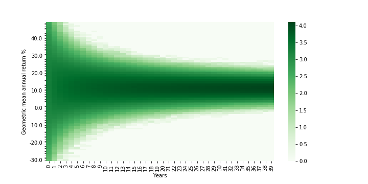
This first chart below is a heatmap showing the likelihood that an investor will earn a certain return in each year (the darker the shade of blue, the more simulations wound up with that geometric return in that year).
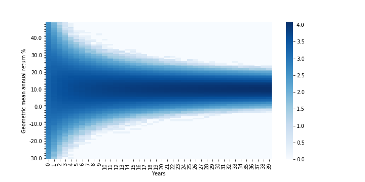
Densities are log (base 10)-adjusted; Assumes S&P500 returns are normally distributed (clipped from -90% to +100%) based on 1928-2019 annual returns; Years go from 0-39 (rather than 1-40)
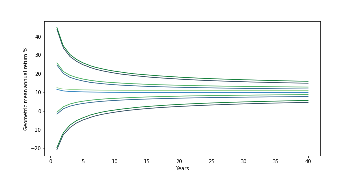
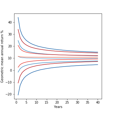
This second chart below is a different view of the same data, calling out what the median return (the light blue-green line in the middle; where you have a 50-50 shot at doing better or worse) looks like. Going “outward” from the median line are lines representing the lower and upper bounds of the middle 50%, 70%, and 90% of returns.
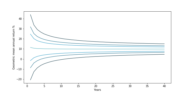
(from outside to middle) 90%, 70%, and 50% confidence interval + median investment returns. Assumes S&P500 returns are normally distributed (clipped from -90% to +100%) based on 1928-2019 annual returns
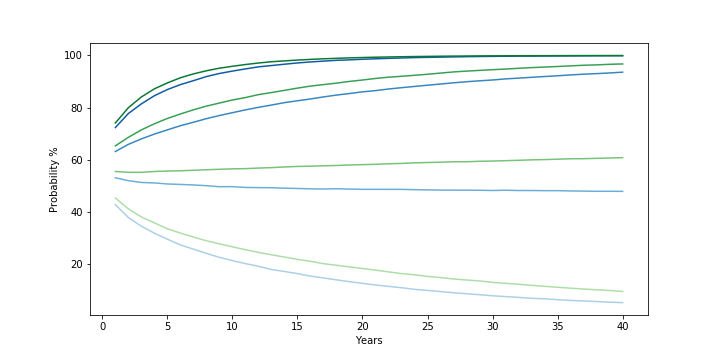
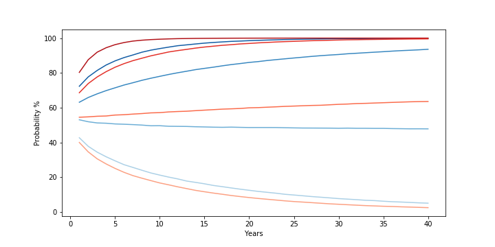
Finally, the third chart below captures the probability that an investment in the S&P500 over 40 years will result not in a loss (the darkest blue line at the top), will beat 5% (the second line), will beat 10% (the third line), and will beat 15% (the lightest blue line at the bottom) returns.
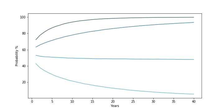
(from top to bottom/darkest to lightest) Probability that 40-year S&P500 returns simulation beat 0%, 5%, 10%, and 15% geometric mean return. Assumes S&P500 returns are normally distributed (clipped from -90% to +100%) based on 1928-2019 annual returns
The charts are a nice visual representation of what uncertainty / volatility mean for an investor and show two things.
First, the level of uncertainty around what an investor will earn declines the longer they can go without touching the investment. In the early years, there is a much greater spread in returns because of the high level of volatility in any given year’s stock market returns. From 1928 – 2019, stock markets saw returns ranging from a 53% increase to a 44% drop. Over time, however, reversion to the mean (a fancy way of saying a good or bad year is more likely to be followed by more normal looking years) narrows the variation an investor is likely to see. As a result, while the median return stays fairly constant over time (starting at ~11.6% in year 1 — in line with the historical arithmetic mean return of the market — but dropping slowly to ~10% by year 10 and to ~9.8% starting in year 30), the “spread” of returns narrows. In year 1, you would expect a return between -21% and 44% around 90% of the time. But by year 5, this narrows to -5% to 25%. By year 12, this narrows further to just above 0% to 19.4% (put another way, the middle 90% of returns does not include a loss). And at year 40, this narrows to 4.6% to 15%.
Secondly, the risk an investor faces depends on the return threshold they “need”. As the probability chart shows, if the main concern is about losing money over the long haul, then the risk of that happening starts relatively low (~28% in year 1) and drops rapidly (~10% in year 7, ~1% in year 23). If the main concern is about getting at least a 5% return, this too drops from ~37% in year 1 to ~10% by year 28. However, if one needs to achieve a return greater than the median (~9.8%), then the probability gets worse over time and gets worse the greater the return threshold needed. To beat a 15% return, in year 1, there is a ~43% chance that this will happen. But this rapidly shrinks to ~20% by year 11, ~10% by year 24, and ~5% by year 40.
The Impact of Increasing Average Annual Return
These simulations are a useful way to explore how long-term returns vary. Let’s see what happens if we increase the (arithmetic) average annual return by 1% from the S&P500 historical average.
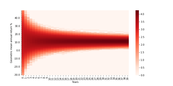
As one might expect, the heatmap for returns (below) generally looks about the same:
Densities are log (base 10)-adjusted; Assumes an asset with normally distributed annual returns (clipped from -90% to +100%) based on 1928-2019 S&P500 annual returns but with 1% higher mean. Years go from 0-39 (rather than 1-40)
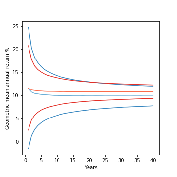
Looking more closely at the contour lines and overlaying them with the contour lines of the original S&P500 distribution (below, green is the new, blue the old), it looks like all the lines have roughly the same shape and spread, but have just been shifted upward by ~1%.
(from outside to middle/darkest to lightest) 90%, 50% confidence interval, and median investment returns for S&P500 (blue lines; assuming normal distribution clipped from -90% to +100% based on 1928-2019 annual returns) and hypothetical investment with identical variance but 1% higher mean (green lines)
This is reflected in the shifts in the probability chart (below). The different levels of movement correspond to the impact an incremental 1% in returns makes to each scenario. For fairly low returns (i.e. the probability of a loss), the probability will not change much as it was low to begin with. Similarly, for fairly high returns (i.e., 15%), adding an extra 1% is unlikely to make you earn vastly above the median. On the other hand, for returns that are much closer to the median return, the extra 1% will have a much larger relative impact on an investment’s ability to beat those moderate return thresholds.
(from top to bottom/darkest to lightest) Probability that 40-year S&P500 returns simulation beat 0%, 5%, 10%, and 15% geometric mean return. Assumes S&P500 returns are normally distributed (clipped from -90% to +100%) based on 1928-2019 annual returns. Higher average return investment is a hypothetical asset with identical variance but 1% higher mean
Overall, there isn’t much of a surprise from increasing the mean: returns go up roughly in line with the change and the probability that you beat different thresholds goes up overall but more so for moderate returns closer to the median than the extremes.
What about volatility?
The Impact of Decreasing Volatility
Having completed the prior analysis, I expected that tweaking volatility (in the form of adjusting the variance of the distribution) would result in preserving the basic distribution shape and position but narrowing or expanding it’s “spread”. However, I was surprised to find that adjusting the volatility didn’t just impact the “spread” of the distribution, it impacted the median returns as well!
Below is the returns heatmap for an investment that has the same mean as the S&P500 from 1928-2019 but 2% lower variance. A quick comparison with the first heat/density map shows that, as expected, the overall shape looks similar but is clearly narrower.
Densities are log (base 10)-adjusted; Assumes S&P500 returns are normally distributed (clipped from -90% to +100%) based on 1928-2019 annual returns but with 2% lower variance. Years go from 0-39 (rather than 1-40)
Looking more closely at the contour lines (below) of the new distribution (in red) and comparing with the original S&P500 distribution (in blue) reveals, however, that the difference is more than just in the “spread” of returns, but in their relative position as well! The red lines are all shifted upward and the upward shift seems to increase over time. It turns out a ~2% decrease in variance appears to buy a 1% increase in the median return and a 1.5% increase in the lower bound of the 50% confidence interval at year 40!
Left: (from outside to middle/darkest to lightest) 90%, 50% confidence interval, and median investment returns for S&P500 (blue lines; assuming normal distribution clipped from -90% to +100% based on 1928-2019 annual returns) and hypothetical investment with identical mean but 2% lower variance (red lines).
Right: Zoomed-in look just at the median lines and 50% confidence interval bounds
The probability comparison (below) makes the impact of this clear. With lower volatility, not only is an investor better able to avoid a loss / beat a moderate 5% return (the first two red lines having been meaningfully shifted upwards from the first two blue lines), but by raising the median return, the probability of beating a median-like return (10%) gets better over time as well! The one area the lower volatility distribution under-performs the original is in the probability of beating a high return (15%). This too makes sense — because the hypothetical investment experiences lower volatility, it becomes less likely to get the string of high returns needed to consistently beat the median over the long term.
(from top to bottom/darkest to lightest) Probability that 40-year S&P500 returns simulation beat 0%, 5%, 10%, and 15% geometric mean return. Assumes S&P500 returns are normally distributed (clipped from -90% to +100%) based on 1928-2019 annual returns. Low volatility investment is a hypothetical asset with identical mean but 2% lower variance
The Risk-Reward Tradeoff
Unfortunately, it’s not easy to find a “S&P500 but less volatile” or a “S&P500 but higher return”. In general, higher returns tend to go with greater volatility and vice versa.
While the exact nature of the tradeoff will depend on the specific numbers, to see what happens when you combine the two effects, I charted out the contours and probability curves for two distributions with roughly the same median return (below): one investment with a higher return (+1%) and higher volatility (+2% variance) than the S&P500 and another with a lower return (-1%) and lower volatility (-2% variance) than the S&P500:
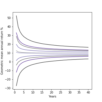
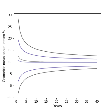
Left: (from outside to middle/darkest to lightest) 90%, 50% confidence interval, and median investment returns for hypothetical investment with 1% higher mean and 2% higher variance than S&P500 (gray) and one with 1% lower mean and 2% lower variance than S&P500 (purple). Both returns assume normal distribution clipped from -90% to +100% with mean/variance based on 1928-2019 annual returns for S&P500.
Right: Zoomed-in look just at the median lines and 50% confidence interval bounds
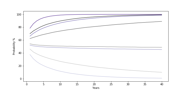
(from top to bottom/darkest to lightest) Probability that 40-year returns simulation for hypothetical investment with 1% higher mean and 2% higher variance than S&P500 (gray) and one with 1% lower mean and 2% lower variance than S&P500 (purple) beat 0%, 5%, 10%, and 15% geometric mean return. Both returns assume normal distribution clipped from -90% to +100% with mean/variance based on 1928-2019 annual returns for S&P500.
The results show how two different ways of targeting the same long-run median return compare. The lower volatility investment, despite the lower (arithmetic) average annual return, still sees a much improved chance of avoiding loss and clearing the 5% return threshold. On the other hand, the higher return investment has a distinct advantage at outperforming the median over the long term and even provides a consistent advantage in beating the 10% return threshold close to the median.
Takeaways
The simulations above made it easy to profile unconventional metrics (geometric mean returns and the probability to beat different threshold returns) across time without doing a massive amount of hairy, symbolic math. By charting out the results, they also helped provide a richer, visual understanding of investment risk that goes beyond the overly simple and widely held belief that “volatility is the same thing as risk”:
- Time horizon matters as uncertainty in returns decreases with time: As the charts above showed, “reversion to the mean” reduces the uncertainty (or “spread”) in returns over time. What this means is that the same level of volatility can be viewed wildly differently by two different investors with two different time horizons. An investor who needs the money in 2 years could find one level of variance unbearably bumpy while the investor saving for a goal 20 years away may see it very differently.
- The investment return “needed” is key to assessing risk: An investor who needs to avoid a loss at all costs should have very different preferences and assessments of risk level than an investor who must generate higher returns in order to retire comfortably, even at the same time. The first investor should prioritize lower volatility investments and longer holding periods, while the latter should prioritize higher volatility investments and shorter holding periods. It’s not just a question of personal preferences about gambling & risk, as much of the discussion on risk tolerance seems to suggest, because the same level of volatility should rationally be viewed differently by different investors with different financial needs.
- Volatility impacts long-run returns: Higher volatility decreases long-term median returns, and lower volatility increases long-term returns. From some of my own testing, this seems to happen at roughly a 2:1 ratio (where a 2% increase in variance decreases median returns by 1% and vice versa — at least for values of return / variance near the historical values for S&P500). The result is that understanding volatility is key to formulating the right investment approach, and it creates an interesting framework with which to evaluate how much to hold of lower risk/”riskless” things like cash and government bonds.
What’s Next
Having demonstrated how simulations can be applied to get a visual understanding of investment decisions and returns, I want to apply this analysis to other problems. I’d love to hear requests for other questions of interest, but for now, I plan to look into:
- Diversification
- Rebalancing
- Withdrawal levels
- Dollar cost averaging
- Asset allocation
- Alternative investment return distributions
Thought this was interesting or helpful? Check out some of my other pieces on investing / finance.
Leave a Reply