The rise of Asia as a force to be reckoned with in large scale manufacturing of critical components like batteries, solar panels, pharmaceuticals, chemicals, and semiconductors has left US and European governments seeking to catch up with a bit of a dilemma.
These activities largely moved to Asia because financially-motivated management teams in the West (correctly) recognized that:
they were low return in a conventional financial sense (require tremendous investment and maintenance)
most of these had a heavy labor component (and higher wages in the US/European meant US/European firms were at a cost disadvantage)
these activities tend to benefit from economies of scale and regional industrial ecosystems, so it makes sense for an industry to have fewer and larger suppliers
much of the value was concentrated in design and customer relationship, activities the Western companies would retain
What the companies failed to take into account was the speed at which Asian companies like WuXi, TSMC, Samsung, LG, CATL, Trina, Tongwei, and many others would consolidate (usually with government support), ultimately “graduating” into dominant positions with real market leverage and with the profitability to invest into the higher value activities that were previously the sole domain of Western industry.
Now, scrambling to reposition themselves closer to the forefront in some of these critical industries, these governments have tried to kickstart domestic efforts, only to face the economic realities that led to the outsourcing to begin with.
Northvolt, a major European effort to produce advanced batteries in Europe, is one example of this. Despite raising tremendous private capital and securing European government support, the company filed for bankruptcy a few days ago.
While much hand-wringing is happening in climate-tech circles, I take a different view: this should really not come as a surprise. Battery manufacturing (like semiconductor, solar, pharmaceutical, etc) requires huge amounts of capital and painstaking trial-and-error to perfect operations, just to produce products that are steadily dropping in price over the long-term. It’s fundamentally a difficult and not-very-rewarding endeavor. And it’s for that reason that the West “gave up” on these years ago.
But if US and European industrial policy is to be taken seriously here, the respective governments need to internalize that reality and be committed for the long haul. The idea that what these Asian companies are doing is “easily replicated” is simply not true, and the question is not if but when will the next recipient of government support fall into dire straits.
From the start, Northvolt set out to build something unprecedented. It didn’t just promise to build batteries in Europe, but to create an entire battery ecosystem, from scratch, in a matter of years. It would build the region’s biggest battery factories, develop and source its own materials, and recycle its own batteries. And, with some help from government subsidies, it would do so while matching prices from Asian manufacturers that had dominated global markets.
Northvolt’s ambitious attempt to compress decades of industry development into just eight years culminated last week, with its filing for Chapter 11 bankruptcy protection and the departure of several top executives, including CEO Peter Carlsson. The company’s downfall is a setback for Europe’s battery ambitions — as well as a signal of how challenging it is for the West to challenge Chinese dominance.
Until recently, I only knew of the existence of cat(astrophe) bonds — financial instruments used to raise money for insurance against catastrophic events where investors profit when no disaster happens.
I had no idea, until reading this Bloomberg article about the success of Fermat Capital Management, how large the space had gotten ($45 billion!!) or how it was one of the most profitable hedge fund strategies of 2023!
This is becoming an increasingly important intersection between climate change and finance as insurance companies and property owners struggle with the rising risk of rising damage from extreme climate events. Given how young much of the science of evaluating these types of risks is, it’s no surprise that quantitative minds and modelers are able to profit here.
The entire piece reminded me of Richard Zeckhauser’s famous 2006 article Investing in the Unknown and Unknowable which covers how massive investment returns can be realized by tackling problems that seem too difficult for other investors to understand.
Investing in cat bonds was the most profitable hedge fund strategy of 2023. Fermat delivered a 20% return, beating the average 8% achieved by hedge funds as a whole. While other cat bond funds did well too, Fermat’s $10 billion portfolio — capturing a quarter of the market — made it by far the most prolific investor to take advantage of a bumper year.
Cat bonds investors are gambling on nature. If a disaster they’ve bet on occurs, their money is used to settle insurance claims. If it doesn’t, they get handsome returns. For decades, the instruments were a last resort reserved for super-rare events, such as a cataclysmic storm on the scale of Hurricane Katrina. But multibillion-dollar calamities have become alarmingly frequent on a warmer planet.
“The insurance market is on edge,” says Seo. “It’s freaked out about risk and wants as little as possible.”
Nice piece in the Economist about how Costco’s model of operational simplicity leads to a unique position in modern retail: beloved by customers, investors, AND workers:
sell fewer things ➡️
get better prices from suppliers & less inventory needed ➡️
lower costs for customers ➡️
more customers & more willing to pay recurring membership fee ➡️
strong, recurring profits ➡️
ability to pay well and promote from within 📈💪🏻
Customers are not the only fans of Costco, as the outpouring of affection from Wall Street analysts after Mr Galanti announced his retirement on February 6th made clear. The firm’s share price is 430 times what it was when he took the job nearly four decades ago, compared with 25 times for the s&p 500 index of large companies. It has continued to outperform the market in recent years.
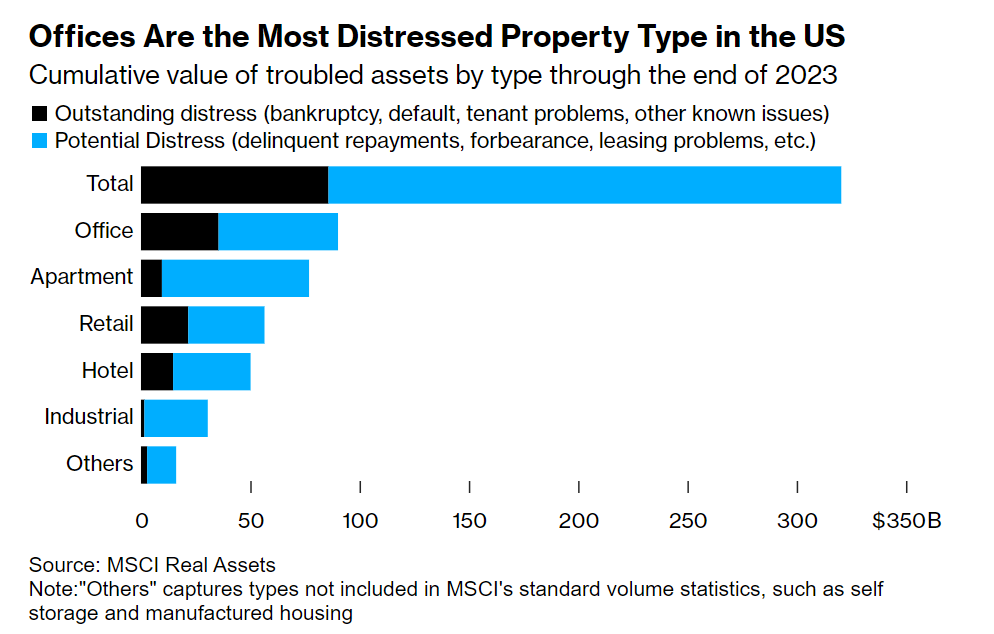
Commercial real estate (and, by extension, community banks) are in a world of hurt as hybrid/remote work, higher interest rates, and property bubbles deflating/popping collide…
Many banks still prefer to work out deals with existing landlords, such as offering loan extensions in return for capital reinvestments toward building upgrades. Still, that approach may not be viable in many cases; big companies from Blackstone to a unit of Pacific Investment Management Co. have walked away from or defaulted on properties they don’t want to pour more money into. In some cases, buildings may be worth even less today than the land they sit on.
“When people hand back keys, that’s not the end of it — the equity is wiped but the debt is also massively impaired,” said Dan Zwirn, CEO of asset manager Arena Investors, which invests in real estate debt. “You’re talking about getting close to land value. In certain cases people are going to start demolishing things.”
One of the core assumptions of modern financial planning and finance is that stocks have better returns over the long-run than bonds.
The reason “seems” obvious: stocks are riskier. There is, after all, a greater chance of going to zero since bond investors come before stock investors in a legal line to get paid out after a company fails. Furthermore, stocks let an investor participate in the upside (if a company grows rapidly) whereas bonds limits your upside to the interest payments.
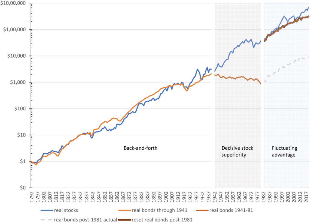
A fascinating article by Santa Clara University Professor Edward McQuarrie published in late 2023 in Financial Analysts Journal puts that entire foundation into doubt. McQuarrie collects a tremendous amount of data to compute total US stock and bond returns going back to 1792 using newly available historical records and data from periodicals from that timeframe. The result is a lot more data including:
coverage of bonds and stocks traded outside of New York
coverage of companies which failed (such as The Second Bank of the United States which, at one point, was ~30% of total US market capitalization and unceremoniously failed after its charter was not renewed)
includes data on dividends (which were omitted in many prior studies)
calculates results on a capitalization-weighted basis (as opposed to price-weighted / equal-weighted which is easier to do but less accurately conveys returns investors actually see)
The data is fascinating, as it shows that, contrary to the opinion of most “financial experts” today, it is not true that stocks always beat bonds in the long-run. In fact, much better performance for stocks in the US seems to be mainly a 1940s-1980s phenomena (see Figure 1 from the paper below)
Stock and bond performance (normalized to $1 in 1792, and renormalized in 1982) on a logarithmic scale Source: Figure 1, McQuarrie et al
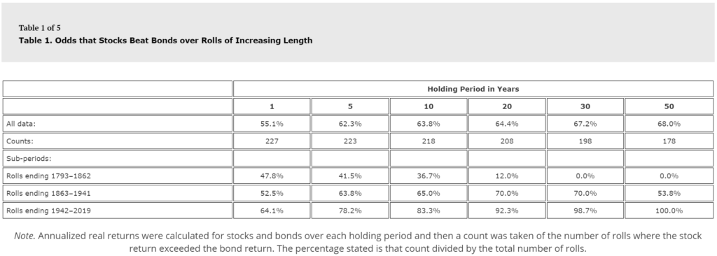
Put another way, if you had looked at stocks vs bonds in 1862, the sensible thing to tell someone was “well, some years stocks do better, some years bonds do better, but over the long haul, it seems bonds do better (see Table 1 from the paper below).
The exact opposite of what you would tell them today / having only looked at the post-War world.
This problem is compounded if you look at non-US stock returns where, even after excluding select stock market performance periods due to war (i.e. Germany and Japan following World War II), focusing even on the last 5 decades shows comparable performance for non-US stocks as non-US government bonds.
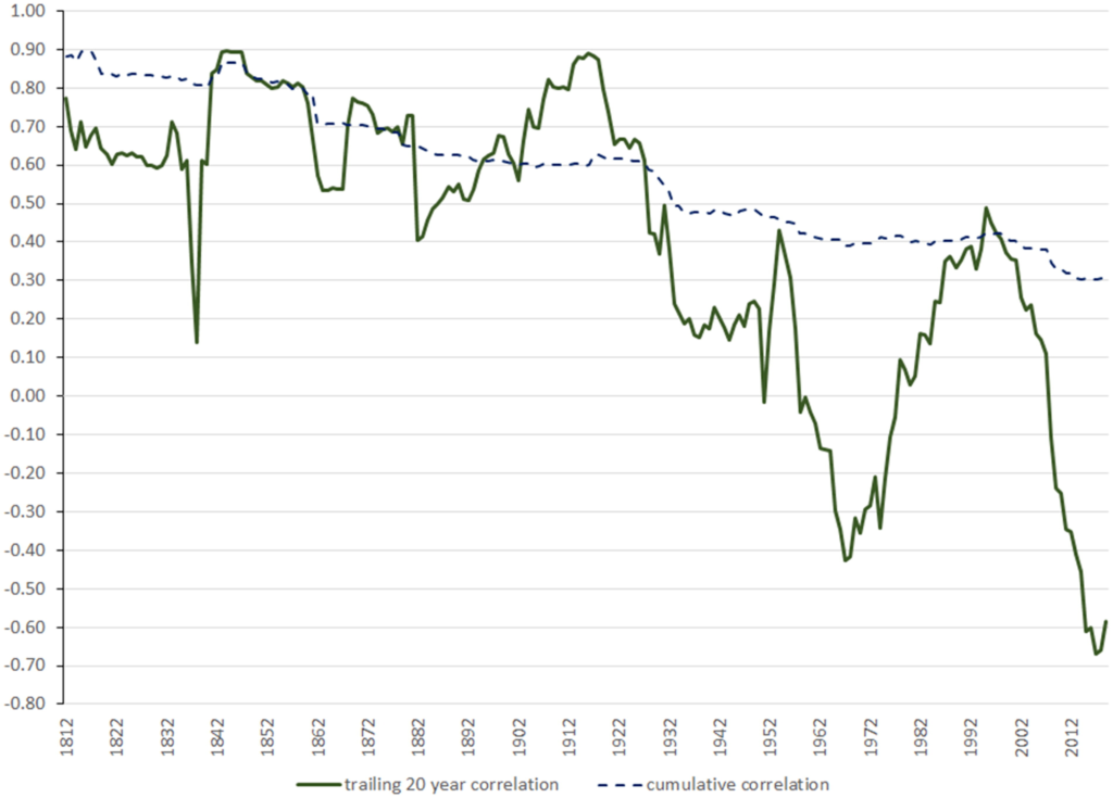
Even assumptions viewed as sacred, like how stocks and bonds can balance each other out because their returns are poorly correlated, shows huge variation over history — with the two assets being highly correlated pre-Great Depression, but much less so (and swinging wildly) afterwards (see Figure 6 below)
Stock and Bond Correlation over Time Source: Figure 6, McQuarrie et al
Now neither I nor the paper’s author are suggesting you change your fundamental investment strategy as you plan for the long-term (I, for one, intend to continue allocating a significant fraction of my family’s assets to stocks for now).
But, beyond some wild theorizing on why these changes have occurred throughout history, what this has reminded me is that the future can be wildly unknowable. Things can work one way and then suddenly stop. As McQuarrie pointed out recently in a response to a Morningstar commenter, “The rate of death from disease and epidemics stayed at a relatively high and constant level from 1793 to 1920. Then advances in modern medicine fundamentally and permanently altered the trajectory … or so it seemed until COVID-19 hit in February 2020.”
If stocks are risky, investors will demand a premium to invest. But if stocks cease to be risky once held for a long enough period—if stocks are certain to have strong returns after 20 years and certain to outperform bonds—then investors have no reason to expect a premium over these longer periods, given that no shortfall risk had to be assumed. The expanded historical record shows that stocks can perform poorly in absolute terms and underperform bonds, whether the holding period is 20, 30, 50, or 100 years. That documentation of risk resolves the conundrum.
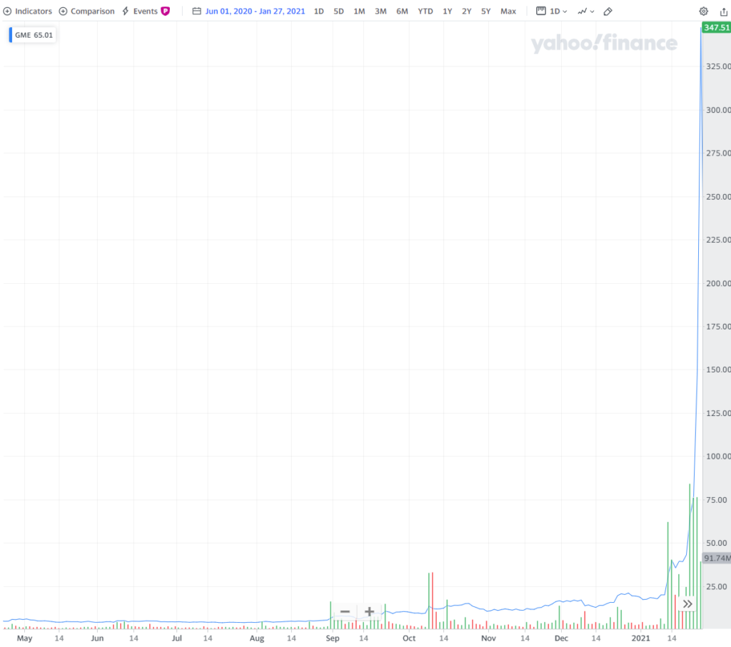
If you’ve been exposed to any financial news in the last few days, you’ll have heard of Gamestop, the mostly brick and mortar video gaming retailer who’s stock has been caught between many retail investors on the subreddit r/WallstreetBets and hedge fund Melvin Capital which had been actively betting against the company. The resulting short squeeze (where a rising stock price forces investors betting against a company to buy shares to cover their own potential losses — which itself can push the stock price even higher) has been amazing to behold with the worth of Gamestop shares increasing over 10-fold in a matter of months.
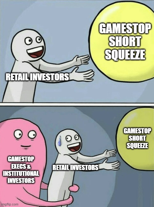
While it’s hard not to get swept up in the idea of “the little guy winning one over on a hedge fund”, the narrative that this is Main Street winning over Wall Street is overblown.
First, speaking practically, it’s hard to argue that giving one hedge fund a black eye by making Gamestop executives & directors and large investment funds holding $100M’s of Gamestop prior to the increase wealthier is anyone winning anything over on Wall Street. And that’s not even accounting for the fact that hedge funds are usually managing a significant amount of money on behalf of pension funds and foundation / university endowments.
Second, while the paper value of recent investments in Gamestop has clearly jumped through the roof, what these investors will actually “win” is unclear. Even holding aside short-term capital gains taxes that many retail investors are unclear on, the reality is that, to make money on an investment, you not only have to buy low, you have to successfully sell high. By definition, any company experiencing a short-squeeze is volume-limited — meaning that it’s the lack of sellers that is causing the increase in price (the only way to get someone to sell is to offer them a higher price). If the stock price changes direction, it could trigger a flood of investors flocking to sell to try to hold on to their gains which can create the opposite problem: too many people trying to sell relative to people trying to buy which can cause the price to crater.
Regulatory and legal experts are better suited to weigh in on whether or not this constitutes market manipulation that needs to be regulated. For whatever it’s worth, I personally feel that Redditors egging each other on is no different than an institutional investor hyping their investments on cable TV.
While many retail investors view these restrictions as a move by Wall Street to screw the little guy, there’s a practical reality here that the brokerages are probably fearful of:
Lawsuits from investors, some of whom will eventually lose quite a bit of money here
SEC actions and punishments due to eventual outcry from investors losing money
I love stories of hedge funds facing the consequences of the risks they take on — but the idea that this is a clear win for Main Street is suspect (as is the idea that the right answer for most retail investors is to HODL through thick and through thin).
While not usually so dramatic, volatility is a fact of life for investors. In researching how to create a long-term investment strategy that can cope with volatility, I found a lot of the writing on the subject unsatisfying for two reasons:
First, much of the writing on investment approaches leans heavily on historical comparisons (or “backtesting”). While it’s important to understand how a particular approach would play out in the past, it is dangerous to assume that volatility will always play out in the same way. For example, take a series of coin tosses. It’s possible that during the most recent 100 flips, the coin came up heads 10 times in a row. Relying mainly on backtesting this particular sequence of coin tosses could lead to conclusions that rely on a long sequences of heads always coming up. In a similar way, investment strategies that lean heavily on backtesting recent history may be well-situated for handling the 2008 crash and the 2010-2019 bull market but fall apart if the next boom or bust happens in a different way.
Second, much of the analysis on investment allocation is overly focused on arithmetic mean returns rather than geometric means. This sounds like a minor technical distinction, but to illustrate why it’s significant, imagine that you’ve invested $1,000 in a stock that doubled in the first year (annual return: 100%) and then halved the following year (annual return: -50%). Simple math shows that, since you’re back where you started, you experienced a return over those two years (in this case, the geometric mean return) of 0%. The arithmetic mean, on the other hand, comes back with a market-beating 25% return [1/2 x (100% + -50%)]! One of these numbers suggests this is an amazing investment and the other correctly calls it as a terrible one! Yet despite the fact that the arithmetic mean always overestimates the (geometric mean) return that an investor experiences, much of the practice of asset allocation and portfolio theory is still focused on arithmetic mean returns because they are easier to calculate and build precise analytical solutions around.
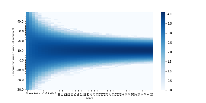
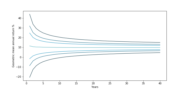
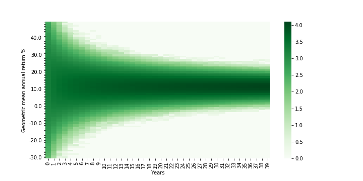
Visualizing a 40-Year Investment in the S&P500
To overcome these limitations, I used Monte Carlo simulations to visualize what volatility means for investment returns and risk. For simplicity, I assumed an investment in the S&P500 would see annual returns that look like a normal distribution based on how the S&P500 has performed from 1928 – 2019. I ran 100,000 simulations of 40 years of returns and looked at what sorts of (geometric mean) returns an investor would see.
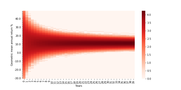
This first chart below is a heatmap showing the likelihood that an investor will earn a certain return in each year (the darker the shade of blue, the more simulations wound up with that geometric return in that year).
Density Map of 40-YearReturns for Investment in S&P500 Densities are log (base 10)-adjusted; Assumes S&P500 returns are normally distributed (clipped from -90% to +100%) based on 1928-2019 annual returns; Years go from 0-39 (rather than 1-40)
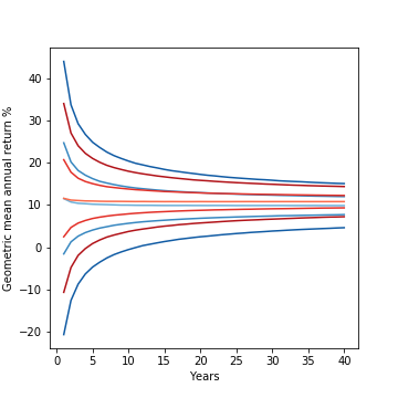
This second chart below is a different view of the same data, calling out what the median return (the light blue-green line in the middle; where you have a 50-50 shot at doing better or worse) looks like. Going “outward” from the median line are lines representing the lower and upper bounds of the middle 50%, 70%, and 90% of returns.
Confidence Interval Map of 40-Year Return for Investment in S&P500 (from outside to middle) 90%, 70%, and 50% confidence interval + median investment returns. Assumes S&P500 returns are normally distributed (clipped from -90% to +100%) based on 1928-2019 annual returns
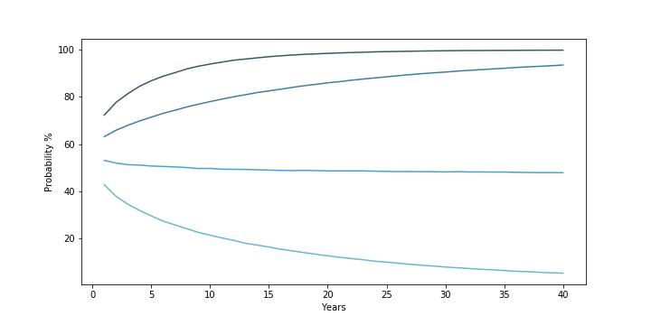
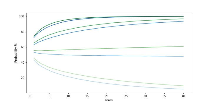
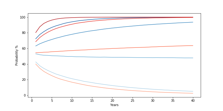
Finally, the third chart below captures the probability that an investment in the S&P500 over 40 years will result not in a loss (the darkest blue line at the top), will beat 5% (the second line), will beat 10% (the third line), and will beat 15% (the lightest blue line at the bottom) returns.
Probability 40-Year Investment in S&P500 will Exceed 0%, 5%, 10%, and 15% Returns (from top to bottom/darkest to lightest) Probability that 40-year S&P500 returns simulation beat 0%, 5%, 10%, and 15% geometric mean return. Assumes S&P500 returns are normally distributed (clipped from -90% to +100%) based on 1928-2019 annual returns
The charts are a nice visual representation of what uncertainty / volatility mean for an investor and show two things.
First, the level of uncertainty around what an investor will earn declines the longer they can go without touching the investment. In the early years, there is a much greater spread in returns because of the high level of volatility in any given year’s stock market returns. From 1928 – 2019, stock markets saw returns ranging from a 53% increase to a 44% drop. Over time, however, reversion to the mean (a fancy way of saying a good or bad year is more likely to be followed by more normal looking years) narrows the variation an investor is likely to see. As a result, while the median return stays fairly constant over time (starting at ~11.6% in year 1 — in line with the historical arithmetic mean return of the market — but dropping slowly to ~10% by year 10 and to ~9.8% starting in year 30), the “spread” of returns narrows. In year 1, you would expect a return between -21% and 44% around 90% of the time. But by year 5, this narrows to -5% to 25%. By year 12, this narrows further to just above 0% to 19.4% (put another way, the middle 90% of returns does not include a loss). And at year 40, this narrows to 4.6% to 15%.
Secondly, the risk an investor faces depends on the return threshold they “need”. As the probability chart shows, if the main concern is about losing money over the long haul, then the risk of that happening starts relatively low (~28% in year 1) and drops rapidly (~10% in year 7, ~1% in year 23). If the main concern is about getting at least a 5% return, this too drops from ~37% in year 1 to ~10% by year 28. However, if one needs to achieve a return greater than the median (~9.8%), then the probability gets worse over time and gets worse the greater the return threshold needed. To beat a 15% return, in year 1, there is a ~43% chance that this will happen. But this rapidly shrinks to ~20% by year 11, ~10% by year 24, and ~5% by year 40.
The Impact of Increasing Average Annual Return
These simulations are a useful way to explore how long-term returns vary. Let’s see what happens if we increase the (arithmetic) average annual return by 1% from the S&P500 historical average.
As one might expect, the heatmap for returns (below) generally looks about the same:
Density Map of 40-YearReturns for Higher Average Annual Return Investment Densities are log (base 10)-adjusted; Assumes an asset with normally distributed annual returns (clipped from -90% to +100%) based on 1928-2019 S&P500 annual returns but with 1% higher mean. Years go from 0-39 (rather than 1-40)
Looking more closely at the contour lines and overlaying them with the contour lines of the original S&P500 distribution (below, green is the new, blue the old), it looks like all the lines have roughly the same shape and spread, but have just been shifted upward by ~1%.
Confidence Interval Map of 40-Year Return for Higher Average Return Investment (Green) vs. S&P500 (Blue) (from outside to middle/darkest to lightest) 90%, 50% confidence interval, and median investment returns for S&P500 (blue lines; assuming normal distribution clipped from -90% to +100% based on 1928-2019 annual returns) and hypothetical investment with identical variance but 1% higher mean (green lines)
This is reflected in the shifts in the probability chart (below). The different levels of movement correspond to the impact an incremental 1% in returns makes to each scenario. For fairly low returns (i.e. the probability of a loss), the probability will not change much as it was low to begin with. Similarly, for fairly high returns (i.e., 15%), adding an extra 1% is unlikely to make you earn vastly above the median. On the other hand, for returns that are much closer to the median return, the extra 1% will have a much larger relative impact on an investment’s ability to beat those moderate return thresholds.
Probability Higher Average Return Investment (Green) and S&P500 (Blue) will Exceed 0%, 5%, 10%, and 15% Returns (from top to bottom/darkest to lightest) Probability that 40-year S&P500 returns simulation beat 0%, 5%, 10%, and 15% geometric mean return. Assumes S&P500 returns are normally distributed (clipped from -90% to +100%) based on 1928-2019 annual returns. Higher average return investment is a hypothetical asset with identical variance but 1% higher mean
Overall, there isn’t much of a surprise from increasing the mean: returns go up roughly in line with the change and the probability that you beat different thresholds goes up overall but more so for moderate returns closer to the median than the extremes.
What about volatility?
The Impact of Decreasing Volatility
Having completed the prior analysis, I expected that tweaking volatility (in the form of adjusting the variance of the distribution) would result in preserving the basic distribution shape and position but narrowing or expanding it’s “spread”. However, I was surprised to find that adjusting the volatility didn’t just impact the “spread” of the distribution, it impacted the median returns as well!
Below is the returns heatmap for an investment that has the same mean as the S&P500 from 1928-2019 but 2% lower variance. A quick comparison with the first heat/density map shows that, as expected, the overall shape looks similar but is clearly narrower.
Density Map of 40-YearReturns for Low Volatility Investment Densities are log (base 10)-adjusted; Assumes S&P500 returns are normally distributed (clipped from -90% to +100%) based on 1928-2019 annual returns but with 2% lower variance. Years go from 0-39 (rather than 1-40)
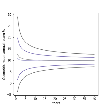
Looking more closely at the contour lines (below) of the new distribution (in red) and comparing with the original S&P500 distribution (in blue) reveals, however, that the difference is more than just in the “spread” of returns, but in their relative position as well! The red lines are all shifted upward and the upward shift seems to increase over time. It turns out a ~2% decrease in variance appears to buy a 1% increase in the median return and a 1.5% increase in the lower bound of the 50% confidence interval at year 40!
Confidence Interval Map of 40-Year Return for Low Volatility Investment (Red) vs. S&P500 (Blue) Left: (from outside to middle/darkest to lightest) 90%, 50% confidence interval, and median investment returns for S&P500 (blue lines; assuming normal distribution clipped from -90% to +100% based on 1928-2019 annual returns) and hypothetical investment with identical mean but 2% lower variance (red lines). Right: Zoomed-in look just at the median lines and 50% confidence interval bounds
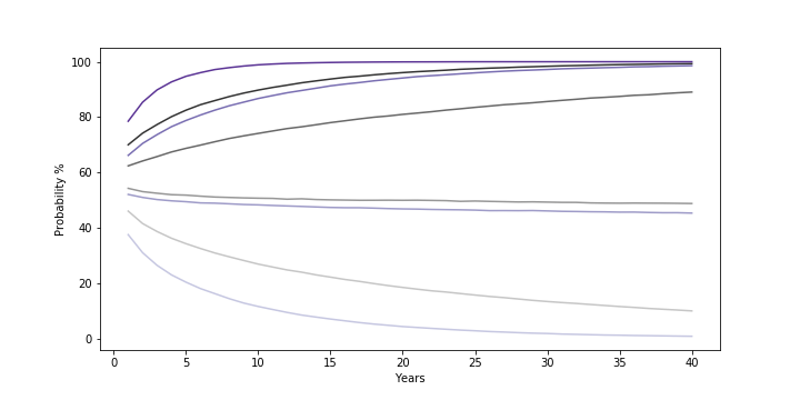
The probability comparison (below) makes the impact of this clear. With lower volatility, not only is an investor better able to avoid a loss / beat a moderate 5% return (the first two red lines having been meaningfully shifted upwards from the first two blue lines), but by raising the median return, the probability of beating a median-like return (10%) gets better over time as well! The one area the lower volatility distribution under-performs the original is in the probability of beating a high return (15%). This too makes sense — because the hypothetical investment experiences lower volatility, it becomes less likely to get the string of high returns needed to consistently beat the median over the long term.
Probability Low Volatility Investment (Red) and S&P500 (Blue) will Exceed 0%, 5%, 10%, and 15% Returns (from top to bottom/darkest to lightest) Probability that 40-year S&P500 returns simulation beat 0%, 5%, 10%, and 15% geometric mean return. Assumes S&P500 returns are normally distributed (clipped from -90% to +100%) based on 1928-2019 annual returns. Low volatility investment is a hypothetical asset with identical mean but 2% lower variance
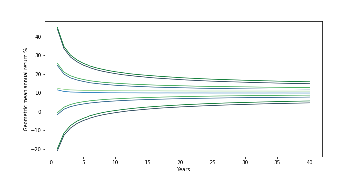
The Risk-Reward Tradeoff
Unfortunately, it’s not easy to find a “S&P500 but less volatile” or a “S&P500 but higher return”. In general, higher returns tend to go with greater volatility and vice versa.
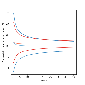
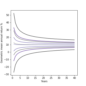
While the exact nature of the tradeoff will depend on the specific numbers, to see what happens when you combine the two effects, I charted out the contours and probability curves for two distributions with roughly the same median return (below): one investment with a higher return (+1%) and higher volatility (+2% variance) than the S&P500 and another with a lower return (-1%) and lower volatility (-2% variance) than the S&P500:
Confidence Interval Map for Low Volatility/Low Return (Purple) vs. High Volatility/High Return (Gray) Left: (from outside to middle/darkest to lightest) 90%, 50% confidence interval, and median investment returns for hypothetical investment with 1% higher mean and 2% higher variance than S&P500 (gray) and one with 1% lower mean and 2% lower variance than S&P500 (purple). Both returns assume normal distribution clipped from -90% to +100% with mean/variance based on 1928-2019 annual returns for S&P500. Right: Zoomed-in look just at the median lines and 50% confidence interval bounds
Probability Low Volatility/Low Return (Purple) vs. High Volatility/High Return (Gray) Exceed 0%, 5%, 10%, and 15% Returns (from top to bottom/darkest to lightest) Probability that 40-year returns simulation for hypothetical investment with 1% higher mean and 2% higher variance than S&P500 (gray) and one with 1% lower mean and 2% lower variance than S&P500 (purple) beat 0%, 5%, 10%, and 15% geometric mean return. Both returns assume normal distribution clipped from -90% to +100% with mean/variance based on 1928-2019 annual returns for S&P500.
The results show how two different ways of targeting the same long-run median return compare. The lower volatility investment, despite the lower (arithmetic) average annual return, still sees a much improved chance of avoiding loss and clearing the 5% return threshold. On the other hand, the higher return investment has a distinct advantage at outperforming the median over the long term and even provides a consistent advantage in beating the 10% return threshold close to the median.
Takeaways
The simulations above made it easy to profile unconventional metrics (geometric mean returns and the probability to beat different threshold returns) across time without doing a massive amount of hairy, symbolic math. By charting out the results, they also helped provide a richer, visual understanding of investment risk that goes beyond the overly simple and widely held belief that “volatility is the same thing as risk”:
Time horizon matters as uncertainty in returns decreases with time: As the charts above showed, “reversion to the mean” reduces the uncertainty (or “spread”) in returns over time. What this means is that the same level of volatility can be viewed wildly differently by two different investors with two different time horizons. An investor who needs the money in 2 years could find one level of variance unbearably bumpy while the investor saving for a goal 20 years away may see it very differently.
The investment return “needed” is key to assessing risk: An investor who needs to avoid a loss at all costs should have very different preferences and assessments of risk level than an investor who must generate higher returns in order to retire comfortably, even at the same time. The first investor should prioritize lower volatility investments and longer holding periods, while the latter should prioritize higher volatility investments and shorter holding periods. It’s not just a question of personal preferences about gambling & risk, as much of the discussion on risk tolerance seems to suggest, because the same level of volatility should rationally be viewed differently by different investors with different financial needs.
Volatility impacts long-run returns: Higher volatility decreases long-term median returns, and lower volatility increases long-term returns. From some of my own testing, this seems to happen at roughly a 2:1 ratio (where a 2% increase in variance decreases median returns by 1% and vice versa — at least for values of return / variance near the historical values for S&P500). The result is that understanding volatility is key to formulating the right investment approach, and it creates an interesting framework with which to evaluate how much to hold of lower risk/”riskless” things like cash and government bonds.
What’s Next
Having demonstrated how simulations can be applied to get a visual understanding of investment decisions and returns, I want to apply this analysis to other problems. I’d love to hear requests for other questions of interest, but for now, I plan to look into:
While it’s impossible to quantify all the intangibles of a college education, the tools of finance offers a practical, quantitative way to look at the tangible costs and benefits which can shed light on (1) whether to go to college / which college to go to, (2) whether taking on debt to pay for college is a wise choice, and (3) how best to design policies around student debt.
The below briefly walks through how finance would view the value of a college education and the soundness of taking on debt to pay for it and how it can help guide students / families thinking about applying and paying for colleges and, surprisingly, how there might actually be too little college debt and where policy should focus to address some of the issues around the burden of student debt.
The Finance View: College as an Investment
Through the lens of finance, the choice to go to college looks like an investment decision and can be evaluated in the same way that a company might evaluate investing in a new factory. Whereas a factory turns an upfront investment of construction and equipment into profits on production from the factory, the choice to go to college turns an upfront investment of cash tuition and missed salary while attending college into higher after-tax wages.
Finance has come up with different ways to measure returns for an investment, but one that is well-suited here is the internal rate of return (IRR). The IRR boils down all the aspects of an investment (i.e., timing and amount of costs vs. profits) into a single percentage that can be compared with the rates of return on another investment or with the interest rate on a loan. If an investment’s IRR is higher than the interest rate on a loan, then it makes sense to use the loan to finance the investment (i.e., borrowing at 5% to make 8%), as it suggests that, even if the debt payments are relatively onerous in the beginning, the gains from the investment will more than compensate for it.
To give an example: if Sally Student can get a starting salary after college in line with the average salary of an 18-24 year old Bachelor’s degree-only holder ($47,551), would have earned the average salary of an 18-24 year old high school diploma-only holder had she not gone to college ($30,696), and expects wage growth similar to what age-matched cohorts saw from 1997-2017, then the IRR of a 4-year degree at a non-profit private school if Sally pays the average net (meaning after subtracting grants and tax credits) tuition, fees, room & board ($26,740/yr in 2017, or a 4-year cost of ~$106,960), the IRR of that investment in college would be 8.1%.
Playing out different scenarios shows which factors are important in determining returns. An obvious factor is the cost of college:
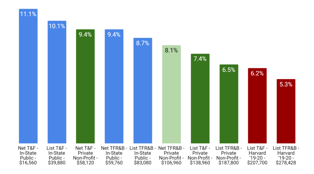
T&F: Tuition & Fees; TFR&B: Tuition, Fees, Room & Board List: Average List Price; Net: Average List Price Less Grants and Tax Benefits Blue: In-State Public; Green: Private Non-Profit; Red: Harvard
As evident from the chart, there is huge difference between the rate of return Sally would get if she landed the same job but instead attended an in-state public school, did not have to pay for room & board, and got a typical level of financial aid (a stock-market-beating IRR of 11.1%) versus the world where she had to pay full list price at Harvard (IRR of 5.3%). In one case, attending college is a fantastic investment and Sally borrowing money to pay for it makes great sense (investors everywhere would love to borrow at ~5% and get ~11%). In the other, the decision to attend college is less straightforward (financially), and it would be very risky for Sally to borrow money at anything near subsidized rates to pay for it.
Some other trends jump out from the chart. Attending an in-state public university improves returns for the average college wage-earner by 1-2% compared with attending private universities (comparing the blue and green bars). Getting an average amount of financial aid (paying net vs list) also seems to improve returns by 0.7-1% for public schools and 2% for private.
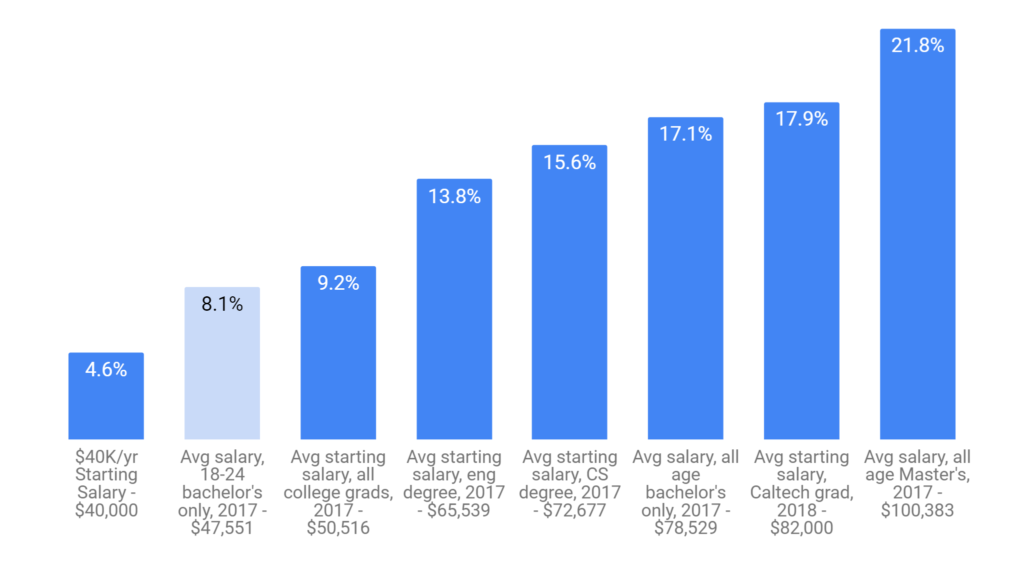
As with college costs, the returns also understandably vary by starting salary:
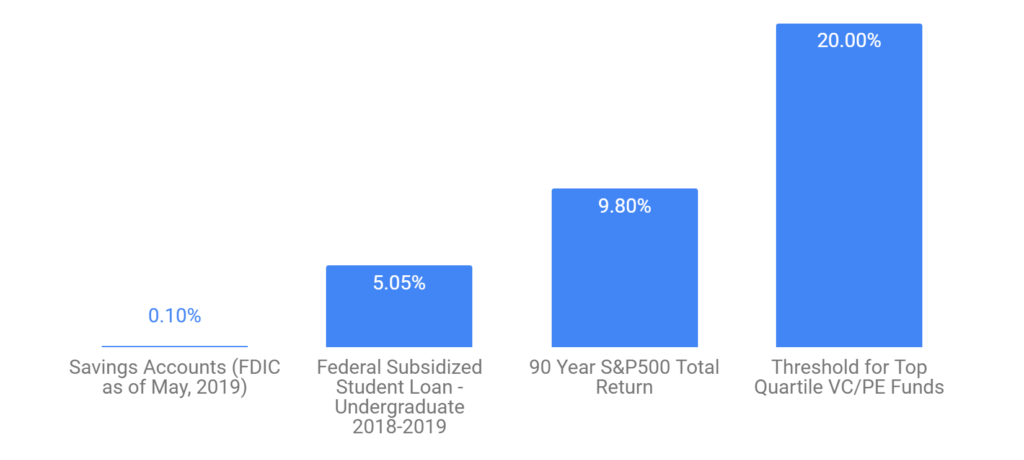
There is a night and day difference between the returns Sally would see making $40K per year (~$10K more than an average high school diploma holder) versus if she made what the average Caltech graduate does post-graduation (4.6% vs 17.9%), let alone if she were to start with a six-figure salary (IRR of over 21%). If Sally is making six figures, she would be making better returns than the vast majority of venture capital firms, but if she were starting at $40K/yr, her rate of return would be lower than the interest rate on subsidized student loans, making borrowing for school financially unsound.
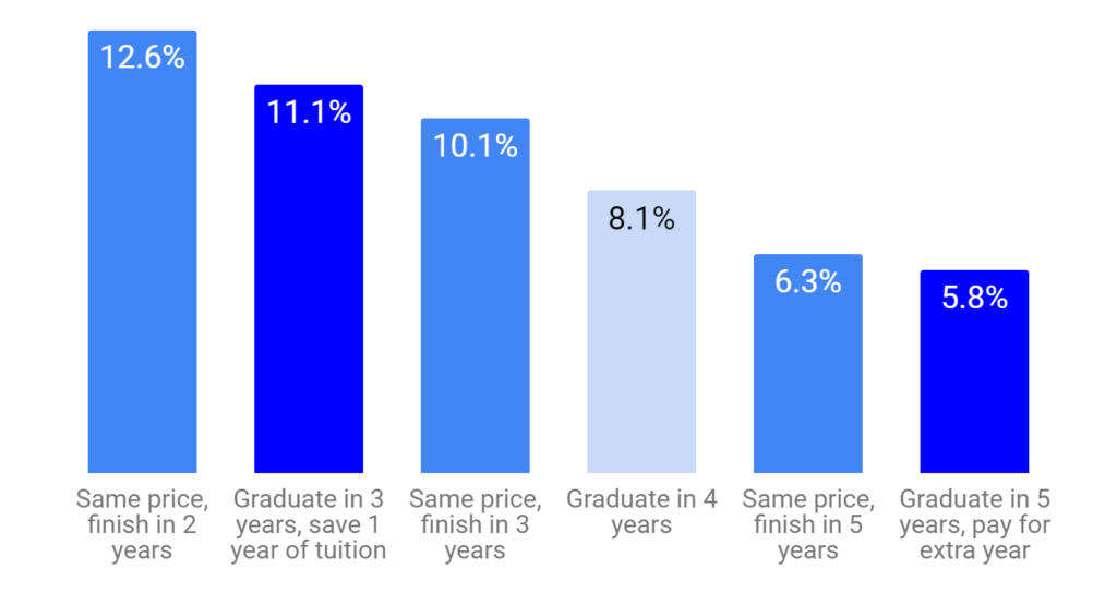
Time spent in college also has a big impact on returns:
Graduating sooner not only reduces the amount of foregone wages, it also means earning higher wages sooner and for more years. As a result, if Sally graduates in two years while still paying for four years worth of education costs, she would experience a higher return (12.6%) than if she were to graduate in three years and save one year worth of costs (11.1%)! Similarly, if Sally were to finish school in five years instead of four, this would lower her returns (6.3% if still only paying for four years, 5.8% if adding an extra year’s worth of costs). The result is that an extra / less year spent in college is a ~2% hit / boost to returns!
Finally, how quickly a college graduate’s wages growrelative to a high school diploma holder’s also has a significant impact on the returns to a college education:
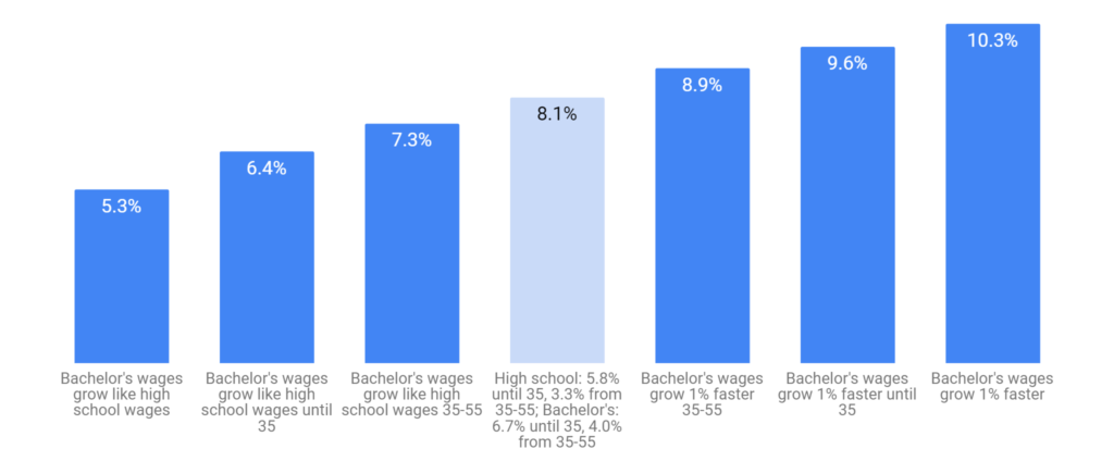
Census/BLS data suggests that, between 1997 and 2017, wages of bachelor’s degree holders grew faster on an annualized basis by ~0.7% per year than for those with only a high school diploma (6.7% vs 5.8% until age 35, 4.0% vs 3.3% for ages 35-55, both sets of wage growth appear to taper off after 55).
The numbers show that if Sally’s future wages grew at the same rate as the wages of those with only a high school diploma, her rate of return drops to 5.3% (just barely above the subsidized loan rate). On the other hand, if Sally’s wages end up growing 1% faster until age 55 than they did for similar aged cohorts from 1997-2017, her rate of return jumps to a stock-market-beating 10.3%.
Lessons for Students / Families
What do all the charts and formulas tell a student / family considering college and the options for paying for it?
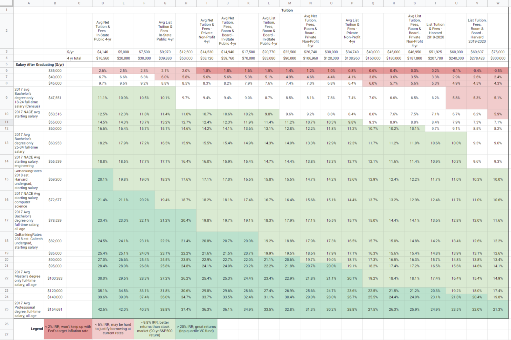
First, college can be an amazing investment, well worth taking on student debt and the effort to earn grants and scholarships. While there is well-founded concern about the impact that debt load and debt payments can have on new graduates, in many cases, the financial decision to borrow is a good one. Below is a sensitivity table laying out the rates of return across a wide range of starting salaries (the rows in the table) and costs of college (the columns in the table) and color codes how the resulting rates of return compare with the cost of borrowing and with returns in the stock market (red: risky to borrow at subsidized rates; white: does make sense to borrow at subsidized rates but it’s sensible to be mindful of the amount of debt / rates; green: returns are better than the stock market).
Except for graduates with well below average starting salaries (less than or equal to $40,000/yr), most of the cells are white or green. At the average starting salary, except for those without financial aid attending a private school, the returns are generally better than subsidized student loan rates. For those attending public schools with financial aid, the returns are better than what you’d expect from the stock market.
Secondly, there are ways to push returns to a college education higher. They involve effort and sometimes painful tradeoffs but, financially, they are well worth considering. Students / families choosing where to apply or where to go should keep in mind costs, average starting salaries, quality of career services, and availability of financial aid / scholarships / grants, as all of these factors will have a sizable impact on returns. After enrollment, student choices / actions can also have a meaningful impact: graduating in fewer semesters/quarters, taking advantage of career resources to research and network into higher starting salary jobs, applying for scholarships and grants, and, where possible, going for a 4th/5th year masters degree can all help students earn higher returns to help pay off any debt they take on.
Lastly, use the spreadsheet*! The figures and charts above are for a very specific set of scenarios and don’t factor in any particular individual’s circumstances or career trajectory, nor is it very intelligent about selecting what the most likely alternative to a college degree would be. These are all factors that are important to consider and may dramatically change the answer.
*To use the Google Sheet, you must be logged into a Google account; use the “Make a Copy” command in the File menu to save a version to your Google Drive and edit the tan cells with red numbers in them to whatever best matches your situation and see the impact on the yellow highlighted cells for IRR and the age when investment pays off
Implications for Policy on Student Debt
Given the growing concerns around student debt and rising tuitions, I went into this exercise expecting to find that the rates of return across the board would be mediocre for all but the highest earners. I was (pleasantly) surprised to discover that a college graduate earning an average starting salary would be able to achieve a rate of return well above federal loan rates even at a private (non-profit) university.
While the rate of return is not a perfect indicator of loan affordability (as it doesn’t account for how onerous the payments are compared to early salaries), the fact that the rates of return are so high is a sign that, contrary to popular opinion, there may actually be too little student debt rather than too much, and that the right policy goal may actually be to find ways to encourage the public and private sector to make more loans to more prospective students.
As for concerns around affordability, while proposals to cancel all student debt plays well to younger voters, the fact that many graduates are enjoying very high returns suggests that such a blanket policy is likely unnecessary, anti-progressive (after all, why should the government zero out the costs on high-return investments for the soon-to-be upper and upper-middle-classes), and fails to address the root cause of the issue (mainly that there shouldn’t be institutions granting degrees that fail to be good financial investments). Instead, a more effective approach might be:
Require all institutions to publish basic statistics (i.e. on costs, availability of scholarships/grants, starting salaries by degree/major, time to graduation, etc.) to help students better understand their own financial equation
Hold educational institutions accountable when too many students graduate with unaffordable loan burdens/payments (i.e. as a fraction of salary they earn and/or fraction of students who default on loans) and require them to make improvements to continue to qualify for federally subsidized loans
Making it easier for students to discharge student debt upon bankruptcy and increasing government oversight of collectors / borrower rights to prevent abuse
Government-supported loan modifications (deferrals, term changes, rate modifications, etc.) where short-term affordability is an issue (but long-term returns story looks good); loan cancellation in cases where debt load is unsustainable in the long-term (where long-term returns are not keeping up) or where debt was used for an institution that is now being denied new loans due to unaffordability
Making the path to public service loan forgiveness (where graduates who spend 10 years working for non-profits and who have never missed an interest payment get their student loans forgiven) clearer and addressing some of the issues which have led to 99% of applications to date being rejected
Special thanks Sophia Wang, Kathy Chen, and Dennis Coyle for reading an earlier version of this and sharing helpful comments!
You can learn a great deal from reading and comparing the financial filings of two close competitors. Tech-finance nerd that I am, you can imagine how excited I was to see Lyft’s and Uber’s respective S-1’s become public within mere weeks of each other.
For two-sided regional marketplaces like Lyft and Uber, an investor should understand the full economic picture for (1) the users/riders, (2) the drivers, and (3) the regional markets. Sadly, their S-1’s don’t make it easy to get much on (2) or (3) — probably because the companies consider the pertinent data to be highly sensitive information. They did, however, provide a fair amount of information on users/riders and rides and, after doing some simple calculations, a couple of interesting things emerged
Uber’s Users Spend More, Despite Cheaper Rides
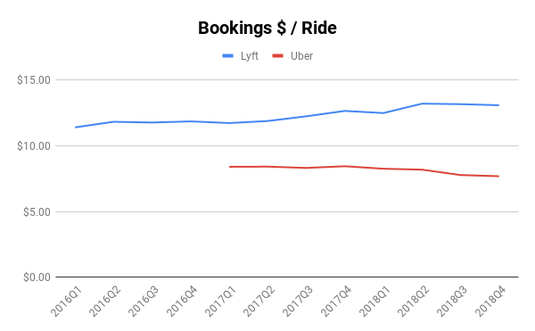
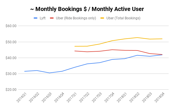
As someone who first knew of Uber as the UberCab “black-car” service, and who first heard of Lyft as the Zimride ridesharing platform, I was surprised to discover that Lyft’s average ride price is significantly more expensive than Uber’s and the gap is growing! In Q1 2017, Lyft’s average bookings per ride was $11.74 and Uber’s was $8.41, a difference of $3.33. But, in Q4 2018, Lyft’s average bookings per ride had gone up to $13.09 while Uber’s had declined to $7.69, increasing the gap to $5.40.
This is especially striking considering the different definitions that Lyft and Uber have for “bookings” — Lyft excludes “ pass-through amounts paid to drivers and regulatory agencies, including sales tax and other fees such as airport and city fees, as well as tips, tolls, cancellation, and additional fees” whereas Uber’s includes “ applicable taxes, tolls, and fees “. This gap is likely also due to Uber’s heavier international presence (where they now generate 52% of their bookings). It would be interesting to see this data on a country-by-country basis (or, more importantly, a market-by-market one as well).
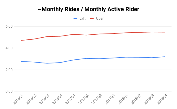
Interestingly, an average Uber rider appears to also take ~2.3 more rides per month than an average Lyft rider, a gap which has persisted fairly stably over the past 3 years even as both platforms have boosted the number of rides an average rider takes. While its hard to say for sure, this suggests Uber is either having more luck in markets that favor frequent use (like dense cities), with its lower priced Pool product vs Lyft’s Line product (where multiple users can share a ride), or its general pricing is encouraging greater use.
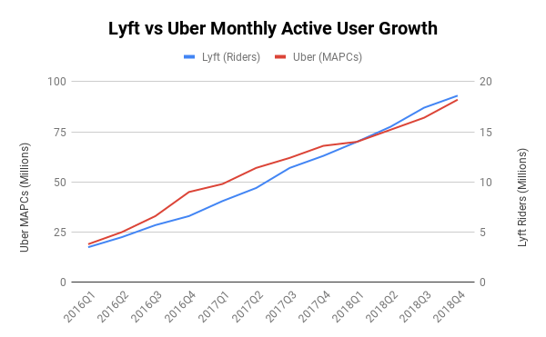
Note: the “~monthly” that you’ll see used throughout the charts in this post are because the aggregate data — rides, bookings, revenue, etc — given in the regulatory filings is quarterly, but the rider/user count provided is monthly. As a result, the figures here are approximations based on available data, i.e. by dividing quarterly data by 3
What does that translate to in terms of how much an average rider is spending on each platform? Perhaps not surprisingly, Lyft’s average rider spend has been growing and has almost caught up to Uber’s which is slightly down.
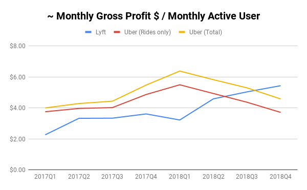
However, Uber’s new businesses like UberEats are meaningfully growing its share of wallet with users (and nearly perfectly dollar for dollar re-opens the gap on spend per user that Lyft narrowed over the past few years). In 2018 Q4, the gap between the yellow line (total bookings per user, including new businesses) and the red line (total bookings per user just for rides) is almost $10 / user / month! Its no wonder that in its filings, Lyft calls its users “riders”, but Uber calls them “Active Platform Consumers”.
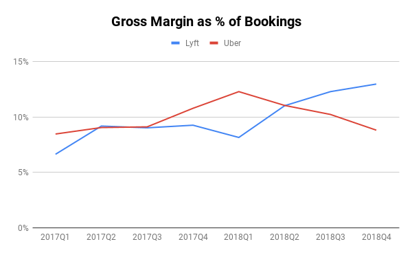
Despite Pocketing More per Ride, Lyft Loses More per User
Long-term unit profitability is more than just how much an average user is spending, its also how much of that spend hits a company’s bottom line. Perhaps not surprisingly, because they have more expensive rides, a larger percent of Lyft bookings ends up as gross profit (revenue less direct costs to serve it, like insurance costs) — ~13% in Q4 2018 compared with ~9% for Uber. While Uber’s has bounced up and down, Lyft’s has steadily increased (up nearly 2x from Q1 2017). I would hazard a guess that Uber’s has also increased in its more established markets but that their expansion efforts into new markets (here and abroad) and new service categories (UberEats, etc) has kept the overall level lower.
Note: the gross margin I’m using for Uber adds back a depreciation and amortization line which were separated to keep the Lyft and Uber numbers more directly comparable. There may be other variations in definitions at work here, including the fact that Uber includes taxes, tolls, and fees in bookings that Lyft does not. In its filings, Lyft also calls out an analogous “Contribution Margin” which is useful but I chose to use this gross margin definition to try to make the numbers more directly comparable.
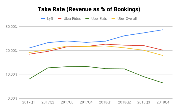
The main driver of this seems to be higher take rate (% of bookings that a company keeps as revenue) — nearly 30% in the case of Lyft in Q4 2018 but only 20% for Uber (and under 10% for UberEats)
Note: Uber uses a different definition of take rate in their filings based on a separate cut of “Core Platform Revenue” which excludes certain items around referral fees and driver incentives. I’ve chosen to use the full revenue to be more directly comparable
The higher take rate and higher bookings per user has translated into an impressive increase in gross profit per user. Whereas Lyft once lagged Uber by almost 50% on gross profit per user at the beginning of 2017, Lyft has now surpassed Uber even after adding UberEats and other new business revenue to the mix.
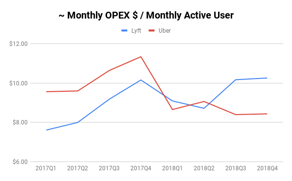
All of this data begs the question, given Lyft’s growth and lead on gross profit per user, can it grow its way into greater profitability than Uber? Or, to put it more precisely, are Lyft’s other costs per user declining as it grows? Sadly, the data does not seem to pan out that way
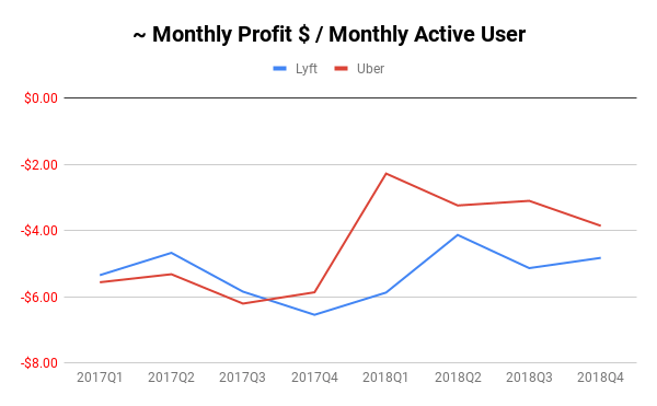
While Uber had significantly higher OPEX (expenditures on sales & marketing, engineering, overhead, and operations) per user at the start of 2017, the two companies have since reversed positions, with Uber making significant changes in 2018 which lowered its OPEX per user spend to under $9 whereas Lyft’s has been above $10 for the past two quarters. The result is Uber has lost less money per user than Lyft since the end of 2017
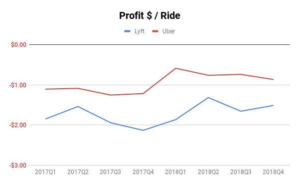
The story is similar for profit per ride. Uber has consistently been more profitable since 2017, and they’ve only increased that lead since. This is despite the fact that I’ve included the costs of Uber’s other businesses in their cost per ride.
One possible interpretation of Lyft’s higher OPEX spend per user is that Lyft is simply investing in operations and sales and engineering to open up new markets and create new products for growth. To see if this strategy has paid off, I took a look at the Lyft and Uber’s respective user growth during this period of time.
The data shows that Lyft’s compounded quarterly growth rate (CQGR) from Q1 2016 to Q4 2018 of 16.4% is only barely higher than Uber’s at 15.3% which makes it hard to justify spending nearly $2 more per user on OPEX in the last two quarters.
Interestingly, despite all the press and commentary about #deleteUber, it doesn’st seem to have really made a difference in their overall user growth (its actually pretty hard to tell from the chart above that the whole thing happened around mid-Q1 2017).
How are Drivers Doing?
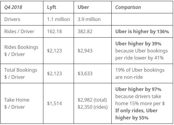
While there is much less data available on driver economics in the filings, this is a vital piece of the unit economics story for a two-sided marketplace. Luckily, Uber and Lyft both provide some information in their S-1’s on the number of drivers on each platform in Q4 2018 which are illuminating.
The average Uber driver on the platform in Q4 2018 took home nearly double what the average Lyft driver did! They were also more likely to be “utilized” given that they handled 136% more rides than the average Lyft driver and, despite Uber’s lower price per ride, saw more total bookings.
It should be said that this is only a point in time comparison (and its hard to know if Q4 2018 was an odd quarter or if there is odd seasonality here) and it papers over many other important factors (what taxes / fees / tolls are reflected, none of these numbers reflect tips, are some drivers doing shorter shifts, what does this look like specifically in US/Canada vs elsewhere, are all Uber drivers benefiting from doing both UberEats and Uber rideshare, etc). But the comparison is striking and should be alarming for Lyft.
Closing Thoughts
I’d encourage investors thinking about investing in either to do their own deeper research (especially as the competitive dynamic is not over one large market but over many regional ones that each have their own attributes). That being said, there are some interesting takeaways from this initial analysis
Lyft has made impressive progress at increasing the value of rides on its platform and increasing the share of transactions it gets. One would guess that, Uber, within established markets in the US has probably made similar progress.
Despite the fact that Uber is rapidly expanding overseas into markets that face more price constraints than in the US, it continues to generate significantly better user economics and driver economics (if Q4 2018 is any indication) than Lyft.
Something happened at Uber at the end of 2017/start of 2018 (which looks like it coincides nicely with Dara Khosrowshahi’s assumption of CEO role) which led to better spending discipline and, as a result, better unit economics despite falling gross profits per user
Uber’s new businesses (in particular UberEats) have had a significant impact on Uber’s share of wallet.
Lyft will need to find more cost-effective ways of growing its business and servicing its existing users & drivers if it wishes to achieve long-term sustainability as its current spend is hard to justify relative to its user growth.
Special thanks to Eric Suh for reading and editing an earlier version!
A look at what Snap’s S-1 reveals about their growth story and unit economics
If you follow the tech industry at all, you will have heard that consumer app darling Snap Inc. (makers of the app Snapchat) has filed to go public. The ensuing Form S-1 that has recently been made available has left tech-finance nerds like yours truly drooling over the until-recently-super-secretive numbers behind their business.
While full-time Wall Street analysts will pour over the figures and comparables in much greater detail than I can, I decided to take a quick peek at the numbers to gauge for myself how the business is doing as a growth investment, looking at:
What does the growth story look like for the business?
Do the unit economics allow for a path to profitability?
What does the growth story look like for the business?
As I’ve noted before, consumer media businesses like Snap have two options available to grow: (1) increase the number of users / amount of time spent and/or (2) better monetize users over time
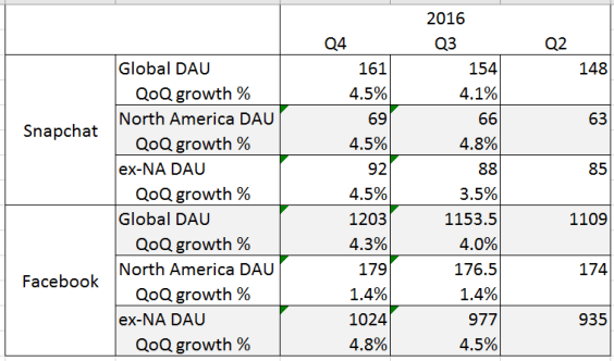
A quick peek at the DAU (Daily Active Users) counts of Snap reveal that path (1) is troubled for them. Using Facebook as a comparable (and using the midpoint of Facebook’s quarter-end DAU counts to line up with Snap’s average DAU over a quarter) reveals not only that Snap’s DAU numbers aren’t growing so much, their growth outside of North America (where they should have more room to grow) isn’t doing that great either (which is especially alarming as the S-1 admits Q4 is usually seasonally high for them).
Last 3 Quarters of DAU growth, by region
A quick look at the data also reveals why Facebook prioritizes Android development and low-bandwidth-friendly experiences — international remains an area of rapid growth which is especially astonishing considering how over 1 billion Facebook users are from outside of North America. This contrasts with Snap which, in addition to needing a huge amount of bandwidth (as a photo and video intensive platform) also (as they admitted in their S-1) de-emphasizes Android development. Couple that with Snap’s core demographic (read: old people can’t figure out how to use the app), reveals a challenge to where quick short-term user growth can come from.
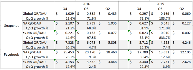
As a result, Snap’s growth in the near term will have to be driven more by path (2). Here, there is a lot more good news. Snap’s quarterly revenue per user more than doubled over the last 3 quarters to $1.029/DAU. While its a long way off from Facebook’s whopping $7.323/DAU (and over $25 if you’re just looking at North American users), it suggests that there is plenty of opportunity for Snap to increase monetization, especially overseas where its currently able to only monetize about 1/10 as effectively as they are in North America (compared to Facebook which is able to do so 1/5 to 1/6 of North America depending on the quarter).
2016 and 2015 Q2-Q4 Quarterly Revenue per DAU, by region
Considering Snap has just started with its advertising business and has already convinced major advertisers to build custom content that isn’t readily reusable on other platforms and Snap’s low revenue per user compared even to Facebook’s overseas numbers, I think its a relatively safe bet that there is a lot of potential for the number to go up.
Do the unit economics allow for a path to profitability?
While most folks have been (rightfully) stunned by the (staggering) amount of money Snap lost in 2016, to me the more pertinent question (considering the over $1 billion Snap still has in its coffers to weather losses) is whether or not there is a path to sustainable unit economics. Or, put more simply, can Snap grow its way out of unprofitability?
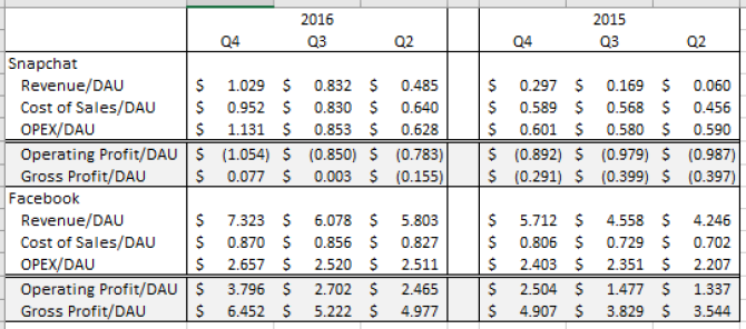
Because neither Facebook nor Snap provide regional breakdowns of their cost structure, I’ve focused on global unit economics, summarized below:
2016 and 2015 Q2-Q4 Quarterly Financials per DAU
What’s astonishing here is that neither Snap nor Facebook seem to be gaining much from scale. Not only are their costs of sales per user (cost of hosting infrastructure and advertising infrastructure) increasing each quarter, but the operating expenses per user (what they spend on R&D, sales & marketing, and overhead — so not directly tied to any particular user or dollar of revenue) don’t seem to be shrinking either. In fact, Facebook’s is over twice as large as Snap’s — suggesting that its not just a simple question of Snap growing a bit further to begin to experience returns to scale here.
What makes the Facebook economic machine go, though, is despite the increase in costs per user, their revenue per user grows even faster. The result is profit per user is growing quarter to quarter! In fact, on a per user basis, Q4 2016 operating profit exceeded Q2 2015 gross profit(revenue less cost of sales, so not counting operating expenses)! No wonder Facebook’s stock price has been on a tear!
While Snap has also been growing its revenue per user faster than its cost of sales (turning a gross profit per user in Q4 2016 for the first time), the overall trendlines aren’t great, as illustrated by the fact that its operating profit per user has gotten steadily worse over the last 3 quarters. The rapid growth in Snap’s costs per user and the fact that Facebook’s costs are larger and still growing suggests that there are no simple scale-based reasons that Snap will achieve profitability on a per user basis. As a result, the only path for Snap to achieve sustainability on unit economics will be to pursue huge growth in user monetization.
Tying it Together
The case for Snap as a good investment really boils down to how quickly and to what extent one believes that the company can increase their monetization per user. While the potential is certainly there (as is being realized as the rapid growth in revenue per user numbers show), what’s less clear is whether or not the company has the technology or the talent (none of the key executives named in the S-1 have a particular background building advertising infrastructure or ecosystems that Google, Facebook, and even Twitter did to dominate the online advertising businesses) to do it quickly enough to justify the rumored $25 billion valuation they are striving for (a whopping 38x sales multiple using 2016 Q4 revenue as a run-rate [which the S-1 admits is a seasonally high quarter]).
What is striking to me, though, is that Snap would even attempt an IPO at this stage. In my mind, Snap has a very real shot at being a great digital media company of the same importance as Google and Facebook and, while I can appreciate the hunger from Wall Street to invest in a high-growth consumer tech company, not having a great deal of visibility / certainty around unit economics and having only barely begun monetization (with your first quarter where revenue exceeds cost of sales is a holiday quarter) poses challenges for a management team that will need to manage public market expectations around forecasts and capitalization.
In any event, I’ll be looking forward to digging in more when Snap reveals future figures around monetization and advertising strategy — and, to be honest, Facebook’s numbers going forward now that I have a better appreciation for their impressive economic model.
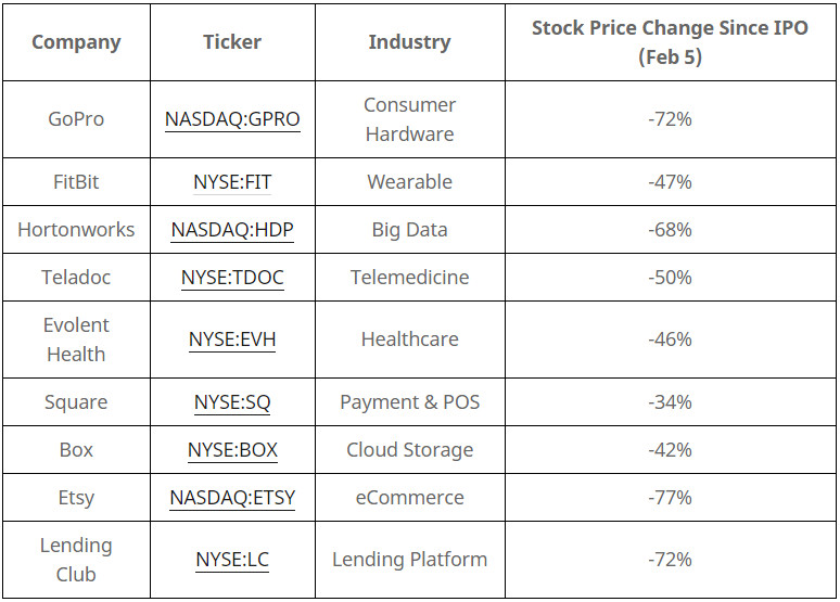
In recent years, it’s been the opposite of controversial to say that the tech industry is in a bubble. The terrible recent stock market performance of once high-flying startups across virtually every industry (see table below) and the turmoil in the stock market stemming from low oil prices and concerns about the economies of countries like China and Brazil have raised fears that the bubble is beginning to pop.
While history will judge when this bubble “officially” bursts, the purpose of this post is to try to make some predictions about what will happen during/after this “correction” and pull together some advice for people in / wanting to get into the tech industry. Starting with the immediate consequences, one can reasonably expect that:
Exit pipeline will dry up: When startup valuations are higher than what the company could reasonably get in the stock market, management teams (who need to keep their investors and employees happy) become less willing to go public. And, if public markets are less excited about startups, the price acquirers need to pay to convince a management team to sell goes down. The result is fewer exits and less cash back to investors and employees for the exits that do happen.
VCs become less willing to invest: VCs invest in startups on the promise that future IPOs and acquisitions will make them even more money. When the exit pipeline dries up, VCs get cold feet because the ability to get a nice exit seems to fade away. The result is that VCs become a lot more price-sensitive when it comes to investing in later stage companies (where the dried up exit pipeline hurts the most).
Later stage companies start cutting costs: Companies in an environment where they can’t sell themselves or easily raise money have no choice but to cut costs. Since the vast majority of later-stage startups run at a loss to increase growth, they will find themselves in the uncomfortable position of slowing down hiring and potentially laying employees off, cutting back on perks, and focusing a lot more on getting their financials in order.
The result of all of this will be interesting for folks used to a tech industry (and a Bay Area) flush with cash and boundlessly optimistic:
Job hopping should slow: “Easy money” to help companies figure out what works or to get an “acquihire” as a soft landing will be harder to get in a challenged financing and exit environment. The result is that the rapid job hopping endemic in the tech industry should slow as potential founders find it harder to raise money for their ideas and as it becomes harder for new startups to get the capital they need to pay top dollar.
Strong companies are here to stay: While there is broad agreement that there are too many startups with higher valuations than reasonable, what’s also become clear is there are a number of mature tech companies that are doing exceptionally well (i.e. Facebook, Amazon, Netflix, and Google) and a number of “hotshots” which have demonstrated enough growth and strong enough unit economics and market position to survive a challenged environment (i.e. Uber, Airbnb). This will let them continue to hire and invest in ways that weaker peers will be unable to match.
Tech “luxury money” will slow but not disappear: Anyone who lives in the Bay Area has a story of the ridiculousness of “tech money” (sky-high rents, gourmet toast,“its like Uber but for X”, etc). This has been fueled by cash from the startup world as well as free flowing VC money subsidizing many of these new services . However, in a world where companies need to cut costs, where exits are harder to come by, and where VCs are less willing to subsidize random on-demand services, a lot of this will diminish. That some of these services are fundamentally better than what came before (i.e. Uber) and that stronger companies will continue to pay top dollar for top talent will prevent all of this from collapsing (and lets not forget San Francisco’s irrational housing supply policies). As a result, people expecting a reversal of gentrification and the excesses of tech wealth will likely be disappointed, but its reasonable to expect a dramatic rationalization of the price and quantity of many “luxuries” that Bay Area inhabitants have become accustomed to soon.
So, what to do if you’re in / trying to get in to / wanting to invest in the tech industry?
Understand the business before you get in: Its a shame that market sentiment drives fundraising and exits, because good financial performance is generally a pretty good indicator of the long-term prospects of a business. In an environment where its harder to exit and raise cash, its absolutely critical to make sure there is a solid business footing so the company can keep going or raise money / exit on good terms.
Be concerned about companies which have a lot of startup exposure: Even if a company has solid financial performance, if much of that comes from selling to startups (especially services around accounting, recruiting, or sales), then they’re dependent on VCs opening up their own wallets to make money.
Have a much higher bar for large, later-stage companies: The companies that will feel the most “pain” the earliest will be those with with high valuations and high costs. Raising money at unicorn valuations can make a sexy press release but it doesn’t amount to anything if you can’t exit or raise money at an even higher valuation.
Rationalize exposure to “luxury”: Don’t expect that “Uber but for X” service that you love to stick around (at least not at current prices)…
Early stage companies can still be attractive: Companies that are several years from an exit & raising large amounts of cash will be insulated in the near-term from the pain in the later stage, especially if they are committed to staying frugal and building a disruptive business. Since they are already relatively low in valuation and since investors know they are discounting off a valuation in the future (potentially after any current market softness), the downward pressures on valuation are potentially lighter as well.